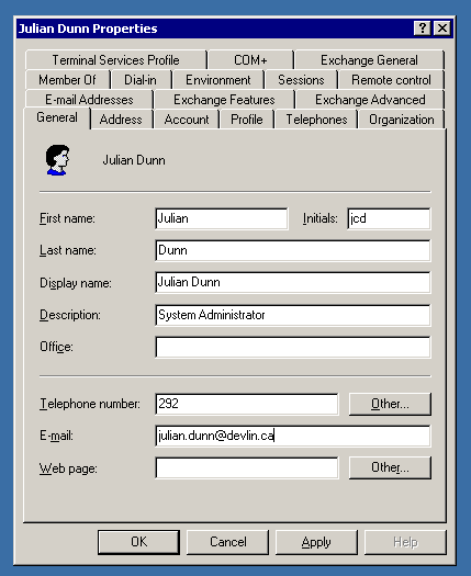
At my new company I unfortunately have to deal with Active Directory. I understand that AD is supposed to be the authoritative source for any information about users, groups, computers, and so on, but does the interface have to be so crammed with junk?
This has got to be the worst interface I’ve ever seen (Lotus Notes aside, but I’ve never had to administer Notes). It’s not clear where to find anything! Not only is the interface kludgy (multiple rows of tabs?) but the tab labels are totally non-intuitive. Why are there at least four tabs pertaining to e-mail (Microsoft Exchange)? What the heck is the Member Of tab for, and how does that differ from what I might find under Account?
I can’t imagine trying to administer hundreds of users with this kludgy tool. Thank God our company is only < 50 people.

Oh my god… you described it to me but it's even worse than I envisioned — FOUR ROWS of tabs!! I think the most I've ever seen before is three, and that's horrible enough…
On the good side, it looks like my company will be in business for a long time to come 🙂
i see alot of trips to chapters in your future… what you also may find useful is the O'Reilly book 'Windows Server Cookbook' which is more like the unix man's guide to windows. Solutions are included for the gui and command line with VB here and there.
'Over 300 recipes!'
I have a copy you can borrow if you like.